Tuesday, 8 May 2012

Final Magazine


This is my final magazine. I think that this looks very professional and is extrememly successful.
 My media has been influenced greatly not only by existing products (Kerrang Magazine) but it has also been shapes by the audeince research that I have carried out.

7. Looking Back At Your Preliminary Task, What Do You Feel You Have Learnt In The Progression From It To The Full Product?

Comparing my work from the beginning of my project to the end, I have imporved a lot.
My preliminary work was very simple, plain and ameature where as my final magazine looks very professional and is successful in my eyes. I have learnt about what works and what doesn't throughout this process. My research has helped me greatly with this, from looking at existing products to creating questionnaires to gather feedback.

Overall I feel my confidence with the editing and composition etc has risen from the start of the project. Looking at existing products allowed me to visualise my layout choices and as result remove those that didn’t work.

I believe my product to be very successful at fulfilling the task set. My product is engaging, of a good quality and meets the codes and conventions of a similar real media product of the same genre. Comparing our continuity task to our final product it is obvious the appearence and content has significantly improved, my editing has also improved greatly.

Improvements from my preliminary task to my final product include;
  • More of a variety of image (the main story)
  • Experiment with the layout a little more.
Yet, in conclusion, I am extrememly pleased with what I have created. I think that this looks very professional and has been a successful project overall!

6. What Have You Learnt About Technologies For The Process Of Constructing This Product?

 Through creating my media product, I have learnt that the technologies needed to make a professional looking and successful product are important. I have used a camera to take the images, computer software (Photoshop) to edit the images and also to piece my magazine together.

Without these technologies my magazine would not be able to look this professional and possibly not even be created at all.

5. How Did You Attract/Address Your Audience?

To attract my audience, I had to consider a number of things. I looked created questionnaires and looked in detail at existing products to help me decided on the appearance etc of my product.
 From this I learnt what would work and what I should use to create a successful and professional looking piece.
 For my front cover I used a young attractive female. This would attract people of the same age. Males would like the look of the model and want to read about her and her music. Yet the females would mostly be interested in the clothing and prizes (as reveled in the questionnaire).
 I have also addressed my target audience because of the colours that I have used. This will attract the audience that prefer rock music to any other types of music.

4. Who Would Be The Audience For Your Media Product?


The target audience for my media product would be teenagers from around 14/15 plus. This is simply because of what the magazine contains. It would be useless trying to sell this product to a younger audience because they wouldn’t be interested. The fonts are harder to read (titles), the images are more ‘adult’ (sticking her fingers up-jokingly) and also the colours aren’t bright and attractive to younger children.
 My magazine also includes interviews and information about music gigs/festivals. This would be useless for younger children as they wouldn’t be able to/allowed to go to these festivals and probably wouldn’t be old enough to understand this type of music.
 I think that my magazine looks really professional and is successfully aimed at my chosen target audience.

3. What Kind Of Media Institution Might Distribute Your Media Product and Why?

The type of media institution that would distribute my media product (magazine) would be IPC Media. This is the leading magazine distributer which would ensure that my magazine reached a wider audience.
 IPC distribute the ‘NME’ magazine which is of a similar genre and have a similar target audience.

2. How Does You Magazine Represent A Particular Social Group

My magazine represents young teens who have a preference to Rock music than other genres.

'BAZINGA' presents images of a young girl who dresses in a particular way. The clothes, make-up, hairstyle and jewellery that she wears provide an 'rock' image, in which the audience would want to copy. She is almost like a role model and advertises the type of music and the magazine in a positive way. Most of the time, social groups are stereotyped with a particular image and actions. This is why I wanted to create a more 'light hearted' magazine where the image of the young girl toned down these stereotypical ideas.

 I think that if I had represented the social group in my magazine in a more negative way, I would sell less of my magazine and make much less profit, if any. I wanted to show a better side to teens, although she is 'flipping us off' inside', it is done in a more innocent way as she isn't doing this out of anger, but fun. This is clear as she is smiling as she is doing it.

Using research, I was able to look at the clothes (colours and styles), the hair and the make-up etc, to create a similar image and idea of genre. The age of the model was also considered as I wanted to appeal to my target audience using a similar aged model (15-18+).

Because of the appearance of my magazine, it is easily recognisable and instantly linked with the 'rock' genre. The title of the magazine is always at the top and will also be recognisable.

1. In What Ways Does Your Media Product Use, Develop Or Challenge Forms and Conventions Of Real Media Products?

My own media product follows the conventions and forms of already existing products. I cannot see any way in which it challenges these conventions.
 Looking at my research for the appropriate and similar types of work that I would like to produce, there are many similarities. Such as the layout, the colours, the style of magazine, the types of images and also the overall look and feel to the product. This shows that I have used this research to create something which looks realistic.
 I followed these conventions and forms as wanted my magazine to look as professional and realistic as possible, this helped ensure this.

 My layout for example was greatly influenced by ‘Kerrang’ magazine. I looked at the ways that the items (text and image) where presented on each page and tried to follow this, using the already existing page as a template for my own work. I have found this to help me a lot with my presentation and I am extremely happy with the way that it looks.

The title of my magazine was chosen to stand out and be a memorable name. ‘Bazinga’
(as chosen by an audience) is the name that I have used and I think that it is rather fitting. It is a fun name, also reflecting the type of magazine that it is, it will also hold a place in the memory.

The setting for my images is simple. The photographs where taken at the front of a black, painted, wooden door. I think that this works well because the dark colour links with the ‘rock’ theme and allows me to stick to a particular colour scheme. This ensures that my product looks as professional as possible. I have tried to almost ‘stereotype’ my images to link them with the ‘rock’ theme. To do this I used a model with pale skin, dark eye make-up and dark clothing (leather jacket). This is seen to be the ‘usual’ appearance of someone who is linked with the genre rock. I used these ideas not to be stereotype in a negative way, but just to simply allow the audience to see at first glance what type of genre this magazine is.

Magazine Photo Shoot

As I have decided on my chosen theme (Rock), I wanted to start off with doing a photo shoot. I will nmake sure the I have chosen the right model, clothing, hair styles, make-up etc using my research and findings to help me.


How Feedback Has Helped

The feedback that I have collected has helped me greatly in a number of ways.

Through gathering this from questionnaires etc I have been able to cater to many needs, likes and wants. Such as what appears within the magazine (the pages that I have created). I have looked at the numbers and statistics that I collected to look at what the majority of people wanted to see. In doing, this I will then have a larger market audience and would (if real) seel many more of this magazine than if I didn't do this research.

Overall, the feedback has allowed me to create the most succesful and professional magazine that I could make. This caters to what the audience want, making it more personal.

Ouestionnaire

I asked 20 students (mixed gender) at my college (my target audience range) several questions to help me within my project. Here are the results that I obtained;


1. What type/genre of music magazine would you buy? 
- Mixed genre (5)
- R&B (4)
- Rock (9)
- Reggae (1)
- Other' (1)


2. What would influence you to buy a magazine?
- Popular/good looking artists (7)
- Reviews of the artists albums/gigs (3)
- Freebies and competitions (2)
- Interviews with old and new (upcoming bands/artists) (5)
- Special issues (3)

Looking at these figures I can see which aspects of a magazine appeal to my target audience the most. I will take this into account when creating my magazine


3. What type of artist/band do you want to see on the cover?
- A new up and coming solo artist (8)
- A new girl band (4)
- A new boy band (3) 
- Existing girl/boy band (3)
- Bringing back old bands/artists (2)


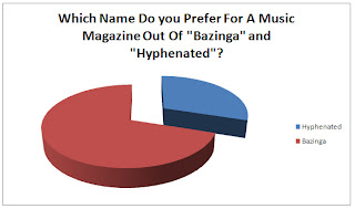
4. Name Ideas
Before I create my magazine I tried to think of different names I could possible use, I came up with the following;

-Amplify
-Bazinga
-Generation

-Hyphenated
-Soundtracked

Out of all the names above I like "Hyphenated" and "Bazinga" the best. As I couldn't decide, I asked a number of people in my class for their opinion and the most of them liked "Bazinga". They thought it sounded appropriate for a music magazine, and especially one of a rock genre magazine.


Final decisions

 After researching several different genres and styles of music magazines and also researching what the potential audience/target audience want, I have come to some conclusions. I have decided to create a magazine with the name 'Bazinga', the genre of 'Bazinga' will be rock. I will use Kerrang magazine to help influence my work in the way of layout, colour scheme and overall appearence and contents.
My questionnaire results have helped give me ideas on how to structure my magazine cover, and what to put in the magazine, as well as the genre and who I will use on the cover.

What Does A Magazine Contain

Most magazines have similar aspects and pages within them. They not only bring stories and interviews but also pleasure, advertisement and entertainment. Most music magazines' deal with the ratings of the latest albums and singles, top 10's and top downloads.

 They have interviews with bands/solo artists/groups and normally have a photo shoot to support the interview. The interviews give a more 'intimate' touch to the magazine, making the reader feel more 'in touch' with their favourite bands/solo artists/celebrities.

Most music magazines contain the following;
-Reviews
-Interviews
-Photo shoots
-Album/single ratings
-Top downloads
-And sometimes ever games (spot the difference etc)

The layouts of the page in the magazines will also alter. Rock will be more 'cluttered' and yet more up-market magazines, such as Vogue, will be more spacious and minimal.

Kerrang Magazine Main Research Influence (Double Page Spread)

Before I start to create my own magazine product, I wanted to research the pages within a magazine. As I liked the layout, genre and overall appearence of the Kerrang magazines, these are the ones that I wanted to look at in more detail.

 Above I have started to look at this double page spread. The colours again are strict and keep to a colour scheme. This time of dark pink, grey, black and white. The layout of the page is very balanced between the two pages. The large image on the left and the title and text/interview on the right.

 Similarly to the front cover and contents page, the text, or at least the titles, are placed infront of coloured shapes to help them become more prominent on the page. The image of the star (above left) is a mid shot (head to waist shot). His clothes are rather casual and yet link with the rock genre. His image (rock) seems obvious because of the stereotypical features such as the tatoo's, dyes hair and just his overall appearence and layed back stance. The two pages are framed by white cicles which could represent the lights around a dressing table.

 The font for the main title changes size and colour. This now only attracts the audience to read this pag/artical but provides variety. The main and largest sentance within this title use the largest text, emphasisizes the fact that this is the title and will draw the audience in, a quote is also used to give an incite into wha tthe story/interview involves. The change in colour also provides  variety on the magazine.


Every aspect of this page has been planned out carefully. I would like to take all of these techniques into account when creating my own magazine.


This is another double page spread by Kerrang. This is slightly different to the one above as this page is darker and uses more images. The interview/story is also lain out differently to the last as there are no titles, this seems to be more like a story than an interview.

Similarly to the previous image, the title is a quote and is the largest text on the page. The colours are again tvaried on the title and the colour scheme is selective, kept to just black, white and red. There are more images included on this page, I like the use of the 'strip' at the bottom. They have also been edited to appear to be in a 'sepia' tone.

 Looking at these two variations of a double page spread, I have been able to take ideas and techniques from both in which I like to the use within my own work. For exampl,e I prefer the interview style layout of the first page (using titles/questions back with shapes). Yet I prefer the image layout of the second page (image strip).


Kerrang Magazine Main Research Influence (Contents page)

Contents Page;


I really love the look and layout of this contents page.
 The colours, like the front cover, are really simple and stick to a colour scheme of grey, black and yellow (some red). All of the images are boxed off and framed creating a more structured page. The images are also then linked up to the titles of the pages (right hand side) by labelling them with the page number below the image.

This magazine seems to be a more 'personal' and very audience friendly (listen to what they want/say). This is shown clearly by the use of the quote below the 'Contents' title. There is also a large paragraph (few paragraphs) from the editor of the magazine (very top left). This give his opinion on each issue and also is something different every time!

 The competitions etc are shown bottom right which give another reason for the audience to purchase this particular named magazine.

Kerrang Magazine Main Research Influence (Front Cover)


The genre of this magazine is Rock. The colour scheme of this magazine is mostly black, yellow, red and white. I think that this is in keeping with the theme/genre. These colours also have connotations with the 'rock' genre.

I really like the way that this cover looks. The layout works very well and the background, and negative space works well to help focus on the image of the person on the front cover. The image is a mid shot, revealing the head to waist of the star. The head of the singer covers some of the title which links the image and text together. 

 The image of the star on the cover fits in with the theme/genre (Rock). The clothing, colours and styles of the clothing and also his hair and overall appearance push the genre of the magazine as they have obviously used someone who looks more 'rocky' to star on the cover. The text is 'rough' and distressed which again, fits with the genre of the magazine.

On the cover, there are lots of use of shapes to back the text and to ask frame some of the images. This gives a more structured feel to the image and yet having everything at a slight angle gives a more 'fun' and layer back approach to it all.

To catch the attention of the audience, large fonts, bold shapes, large images, and bright colours have been used. The use of quotes, page titles and competitions would also entice the audience to purchase this issue as just by reading the cover, they can see what is held within. "We Found A New World" is a rather vague and mysterious quote and would draw in the audience to want to read about this in more detail to find out what was actually meant here.

The use of all of these aspects will help me to create not only a professional looking magazine front cover, but also a successful and would be well selling issue! To do this, I will have to take into account all of these things that I have mentioned above!

Preliminary 2 and Chosen Theme/Genre

After looking at my preliminary, I wanted to try to create something a little more 'professional'.
 I have not used my own image (Beyonce) but have simply used her to see what my magazine would look like now. I have used Q Magazine (below) to influence me.


I think that this magazine (below) looks much better than my previous one. The colours work much better together and compliment eachother.
 This magazine looks much more 'up-market' and would sell to a different audience with different music tastes (R&B and Pop).


Although I like the more 'classy' magazine. I think I would like to create a magazine with more of a rock theme.

Contact Sheet (Preliminary)


Here is my contact sheet for the photo shoot that I have done to use on my preliminary magazine cover. I wanted to use a happy, good looking student who also looks respectable and 'natural'. I chose Hannah.

I also took pictures (10, 11, 12) of the stairwells and emergency exit doors. This was in case I wanted to add a story on safety within college etc.

For my magazine, I used the 20th image. I thought that her stance looked the best and also that she looked happy on this. I would now like to create my magazine.


(Left)


Friday, 4 May 2012

Preliminary Magazine (Contents layout)

The layout of a magazine can make or break it. If the page isn't interesting, balanced and just overall well presented and professional, people wont want to read it.

Below, I have sectioned the page up into blocks to show where I would like to put text and images. This page is rather structured and organised. This is something that you would expect from this type of magazine. Yet the layout varies for different genres of magazines.

For example. A rock magazine would be more 'crowded' and busy. The colours would be dark and the images and text would link with this genre of music/this image.


Preliminary Magazine (Front Cover)

Before I create my real magazine cover. I would like to design a preliminary to see what works and what does not. This will also give me ideas for layout and text/font.


Above, I have created the front cover of a college magazine.
 Through creating this I have realised that the positioning of the model (when taking the picture) is very important. To be able to stick to the 'normal' layout of a magazine, I had to flip the image vertically. This was so that the body was to the right side and the arm separated the text to the left.

The emotions displayed by the model is also important. The fact that this model is smiling and looking directly at the camera invites the audience in and also gives a warm feel to the magazine. This gives the impression that the college is a nice place to be, with friendly students. The clothes/make-up/jewellery worn is important too. The model is wearing blue, which fits in with the colour scheme of the college magazine.

The font and font colour also needs to work well against the background otherwise the text cannot be seen properly. I think, on this image, that the black looks fine. This stands out against the pale walls. Yet the blue is rather bright and is hard to see.

Through research, I have found that the logo's of the magazines are usually at the top of the page. In this instance and this is also the case when looking at 'Q Magazine'.